Goal: Create an elegant, responsive sub-navigation for content rich pages. Use an information hierarchy to enable easy, extensible navigation.

Design Process: Began with a competitive analysis and case studies of how other airlines were managing these types of content heavy page types. Part of this research brought to light that few airlines were handling it well. In response I developed multiple design solutions in low fidelity. Once reviewed with the team and stakeholders, I lead the effort to develop medium fidelity prototypes and test them with usertesting.com. User feedback played a large role in determing the direction that was taken.
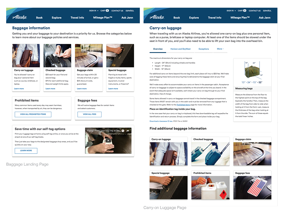
Design Solution: The implemented concept utilizes “tiles and tabs” to aid customers in finding the content they seek. Photo Tiles on the landing page will take you all of the content on that subject. Once in-page sub content
is tabbed and highlighted. Footer tiles indicate quick navigation to more content.

Prototype Landing Page Tiles: Providing three elements of what content could be found on a sub page (image, title and brief description) helped users in the study to find the content they sought.
Prototype Content Page Tiles: Offered users a means to navigate to other pages without having to navigate back.

Tabs: Prior design suffered primarily from two major flaws. 1. Content heavy pages were often very long and as a result it was challenging to find specific content. 2. The older format was not repsonsive and navigation was inconsistently applied.
The new sub navigation allows for a subject to be divided into meaningful, digestable sections. The page title and overview stay with the user, while the nested, tabbed section titles are highlighted.


